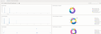
Starting off with a screenshot that is indecipherable may seem strange, but please humour me.
The screenshot shows some of the widgets from an OCI Logging Analytics Dashboard I created specifically for one of my OIC instances.
My goal was to give OIC admins the salient data they need in one dashboard. You can decide whether my "salient" applies to you, if not, you can certainly extrapolate from what I did.
I'll go through the widgets one by one, starting off with Billed Messages -
As you can see, I don't have many messages here. This is because I'm using one of my test instances. But, anyway, I see my exact billed message consumption.
Let's look into what's powering this widget -
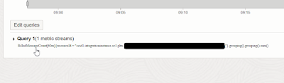
This widget is based on the OCI Service metric for OIC -
BilledMessageCount.
Let's create this in a new dashboard -
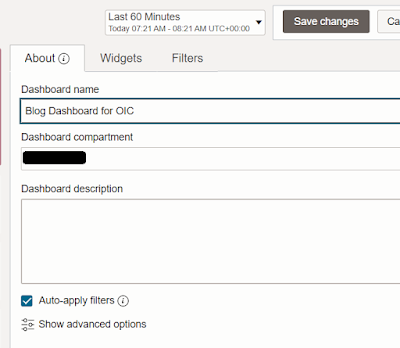
I give it a name -
then I create a metric based widget -
I don't see any data, so I choose a longer time window -
Now I see some data -
But let's go for a bar chart -
Let's give it a title -
Now we change the statistic on the source data, as we want the message count -
I then check for the last hour and see much fewer messages -
Now back to editing the data source - I can also add more dimensions -
integrationFlowIdentifier - allows me to get the stats for a specific integration.
adapterIdentifier - allows me to get the stats for integrations triggered by a specific adapter. All my demo app driven integrations is this instance have REST triggers, so I only see rest -
resourceId - the value shown here is the oic ocids. I only see 1, as I have only one OIC instance actively processing requests during this time window. I'll add this dimension, as this dashboard is for a specific OIC instance.
I then click apply and see my widget in the dashboard -
Billed Messages are on an hourly basis so I change the time window to the last 24 hours -
The next widget will break down these numbers by integration. This tells me where the money is being spent, from an integration perspective.
We edit the dashboard -
and create a query based widget -
Essentially, what I want is a pie chart showing the billed message breakdown, grouped by integration.
So where will get this query from?
The easiest way is via the OCI Service Metrics, shown on your OIC instances' page in OCI -
I go to the consumed messages section -
Here's the base query-
Edit the query to add the group by integration -
then click
Create Alarm -
this will open a dialogue to create an alarm based on the query. However, we will only copy the query -
Mine is as follows - BilledMessageCount[60m]{resourceId = "myOIC-OCID"}.grouping().sum()
Exit the Create Alarm screen and return to our dashboard - here we click Create query based widget -
Overwrite the query offered -
with the following - BilledMessageCount[60m]{resourceId = "
myOIC-OCID"}.grouping(
integrationFlowIdentifier).sum()
Change the Visualisation to Pie Chart -
Save the widget, to return to the dashboard -
I now increase the time window to 7 days. during this time I did some large load tests, using an integration, ProcessOrder.
The dashboard tells me that, in the last 7 days, the ProcessOrder integration consumed 99.9% of the billable messages.
I change the time window to 3 days -
The next 2 widgets I add are related to technical messages and their breakdown by integration.
There is a subtle difference between technical and billable messages e.g. an app driven integration that has a request payload of 80kb, counts as 2 billable messages, as it is over the 50kb limit.
These 2 new widgets will essentially be a variation on what we have already done for billed messages.
The next widget with be query based and here's the query -
MessagesReceivedCount[60m]{resourceId = "your-OIC-OCID"}.grouping(flowCode).sum()
Note the group by here is using flowCode and not integrationFlowIdentifier, however, both refer to the integration.
The next pair of widgets highlight adapter errors -
Both of these are query based widgets -
Adapter Errors - I check here for outbound invokes that have a response status of http 500.
NumberOfOutboundRequests[5m]{resourceId = "ocid1.integrationinstance.oc1.phx.myOIC-OCID", outboundInvocationResponseStatus = "500"}.sum()
Adapter Errors by Integration - this uses the same query, but has the following configuration -
I can hover over the segments of the adapter errors widget to get more details - in this this is a DB adapter error on a SELECT.
The FTP adapter error is on a LIST files.
One can also create more generic error widgets -
Failed Messages - is a widget based on the service metric,
MessagesFailedCount.
Failed Messages by Integration - is a query based widget. The query is as follows -
MessagesFailedCount[5m]{resourceId = "ocid1.integrationinstance.oc1.phx.myOIC-OCID"}.sum()
Configuration is as follows -
Finally let's consider the situation, where I've literally 100s of integrations running in production. The pie charts I've used my not be all that appropriate. However, I can amend the queries to just show the top 5 or 10 integrations etc.
Just amend the queries as follows -
BilledMessageCount[1m].grouping(integrationFlowIdentifier).sum().top_n(5)
Note that only 4 integrations are listed above.
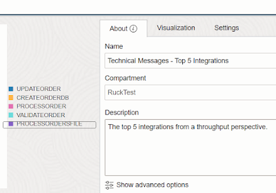
Now to the Technical Messages - Top 5 Integrations widget - here the query is - MessagesReceivedCount[1m].grouping(flowCode).sum().top_n(5)
Note, I see 5 integrations here, the extra one is a scheduled job that just reads a very small file, < 50kb, hence not chargeable.
Quo Vadis? Gen2 Usage Metrics?
Some customers want a monthly overview of billed messages. This is common for OIC for SaaS customers who have a monthly commit of a number of packs of 1 million messages.
This data can be easily extracted from the first widget I created -
Here I set the dashboard time window to Jan 1st - Jan 31st.
I refresh the dashboard, then -
This is one of my test OIC instances, one I don't use much -
All I need to do is add a SUM function at the bottom -
Billing data via OCI Monitoring API
I covers the OCI Monitoring api in a
previous post - now to leveraging that api to get the billing metrics.
https://telemetry.us-phoenix-1.oraclecloud.com/20180401/metrics/actions/summarizeMetricsData?compartmentId={{compartmentId}}
The request payload -
{
"namespace": "oci_integration",
"name": "BilledMessageCount",
"query": "BilledMessageCount[5d]{resourceId = \"ocid1.integrationinstance.oc1.phx.yourOIC-OCID\"}.grouping(integrationFlowIdentifier).sum()"
}
The response structure is as follows -
As you can see, invokes of
ProcessOrder generated 7 billed messages in the last 5 days.
Summa Summarum
OCI Logging Analytics allows us to create compelling dashboards for OIC. The widgets I have created are all based on OCI Service Metrics for OIC and can be reused in other dashboards. We can go a step further and push our OIC activity stream data to OCI Logging Analytics, allowing us to create more dashboards based on activity stream data.
Net, net, OCI Logging Analytics is a great addition to your OIC management & monitoring toolkit.
So get dashboarding, my friends!


No comments:
Post a Comment